Creating a design system for Bookworm
Summary
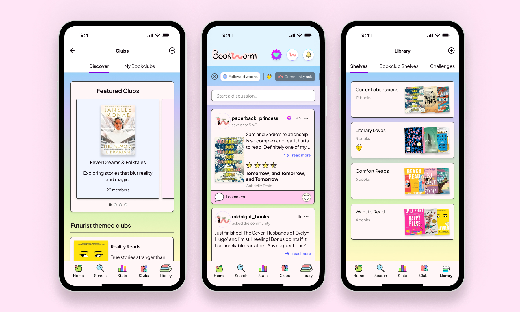
When I joined Bookworm, a vibrant reading app and social community, I saw an opportunity to elevate its visual design while preserving its welcoming, colorful spirit. The app helps users track their reading journey, connect with fellow book lovers, and join book clubs across iOS, Android, and web platforms.
Project type
UX/UI
Role
Designer
Year
2025

The Challenge
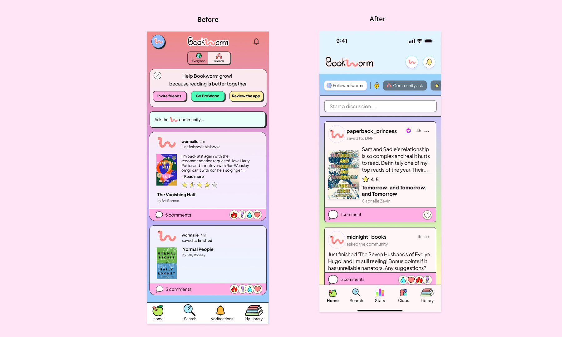
With 70% of our users on mobile, I started with a comprehensive mobile-first design audit. While the existing design was fun and experimental, it needed refinement to reach its full potential. The biggest challenge? The founder loves color (and so do I!), but I needed to approach color strategically while staying true to Bookworm's vibrant personality while ensuring usability and accessibility.
Key issues
- Inconsistent typography across platforms
- Irregular spacing and visual hierarchy
- Inconsistent gradient usage across pages
- Accessibility concerns with color combinations
Research & Strategy
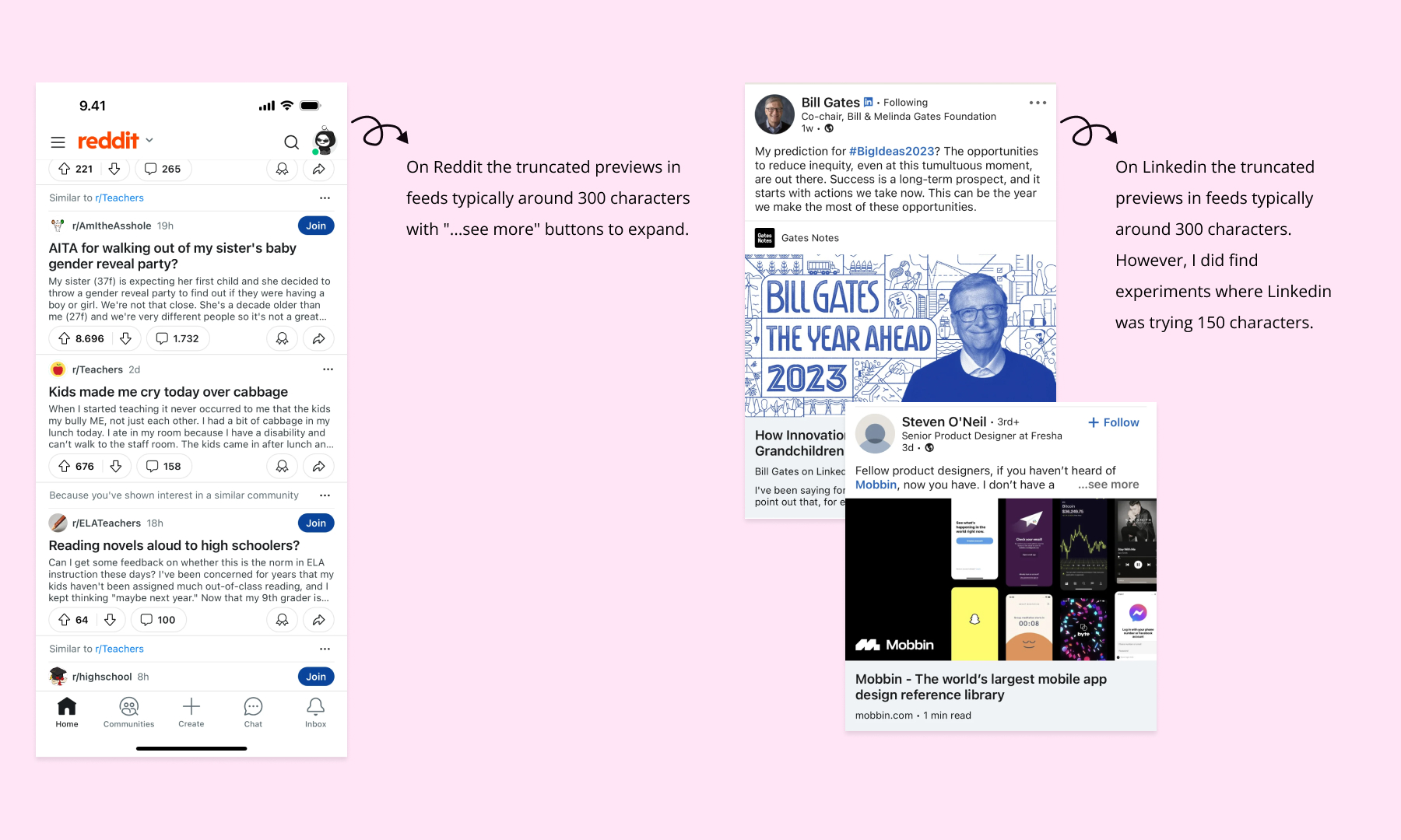
I dove into competitive research, analyzing how other platforms handle similar challenges:
- Social Platforms: Reddit, LinkedIn, Twitter (for text-heavy feeds)
- Wellness Apps: Headspace, Tiimo (for approachable design)
- Direct Competitors: Fable, Storygraph, Goodreads
Building the Foundation
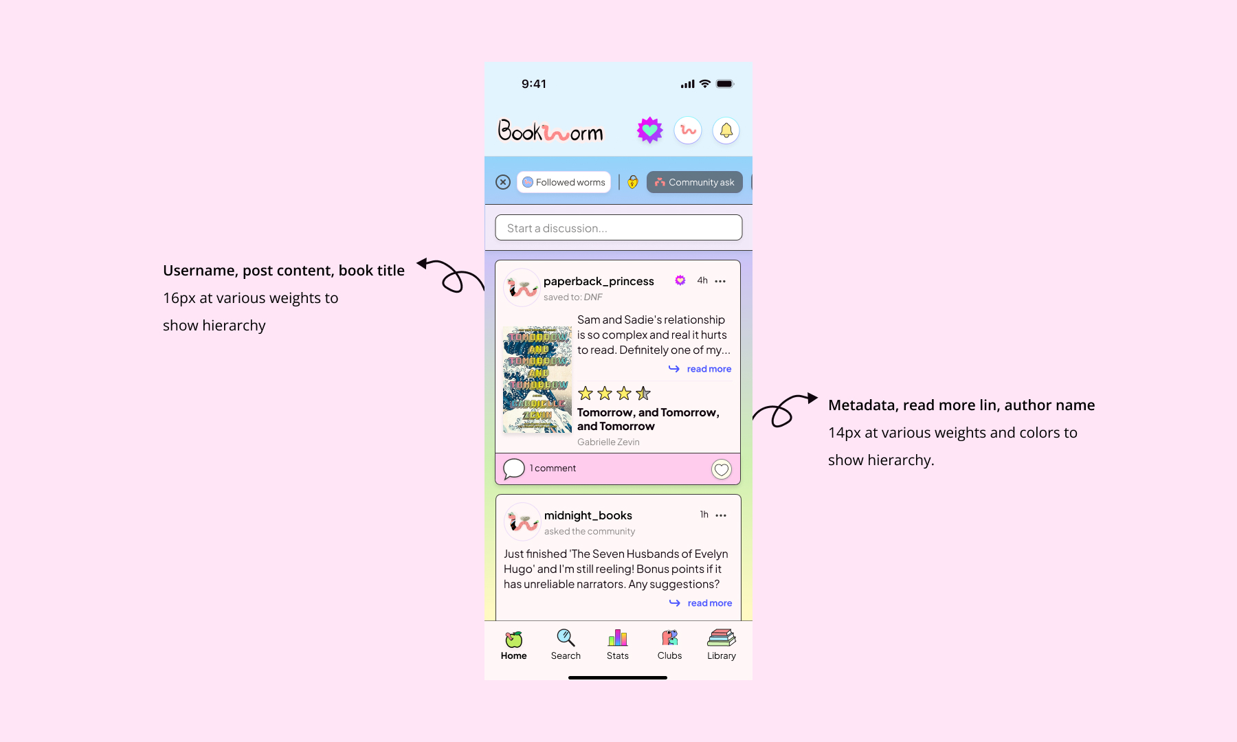
The existing app used multiple header styles and inconsistent font weights that weren't optimally scaled. After extensive testing, I established a clear typography hierarchy based on a 16px base font size for mobile, creating a more cohesive reading experience while maintaining the app's approachable personality.
Color Strategy
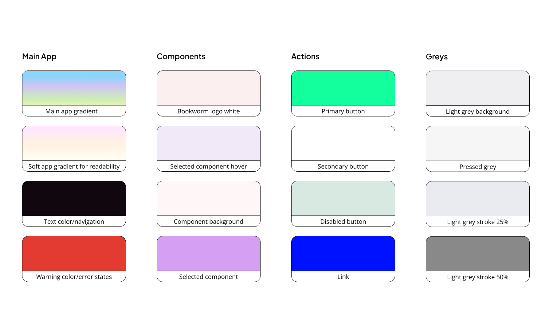
- Defined consistent app backgrounds for main pages
- Created softer color gradients that balance accessibility with vibrancy
- Built a comprehensive color system with defined tokens
- Established clear rules for primary, secondary, and tertiary colors
- Tested color combinations to ensure accessibility compliance
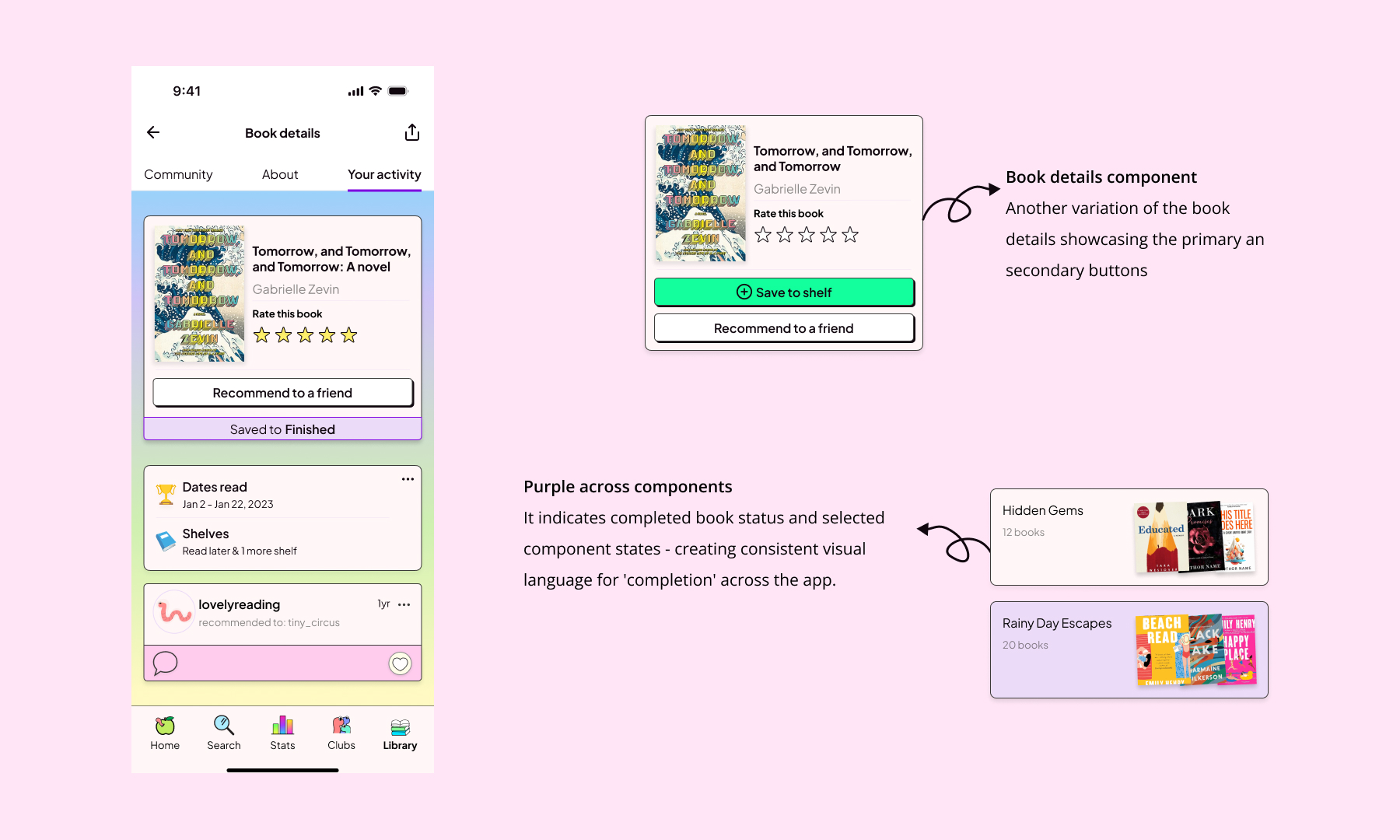
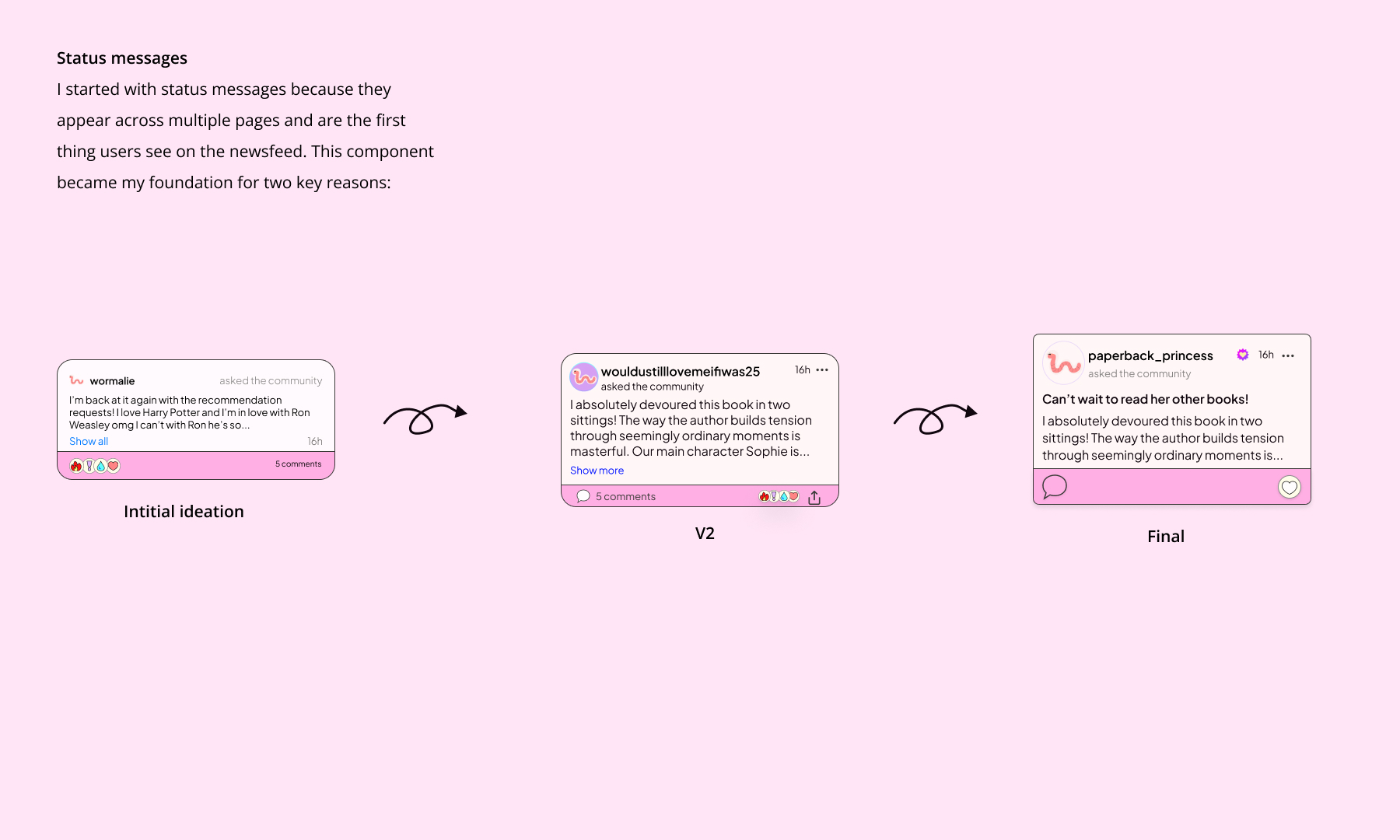
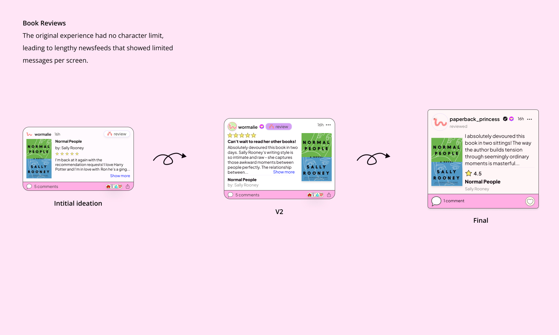
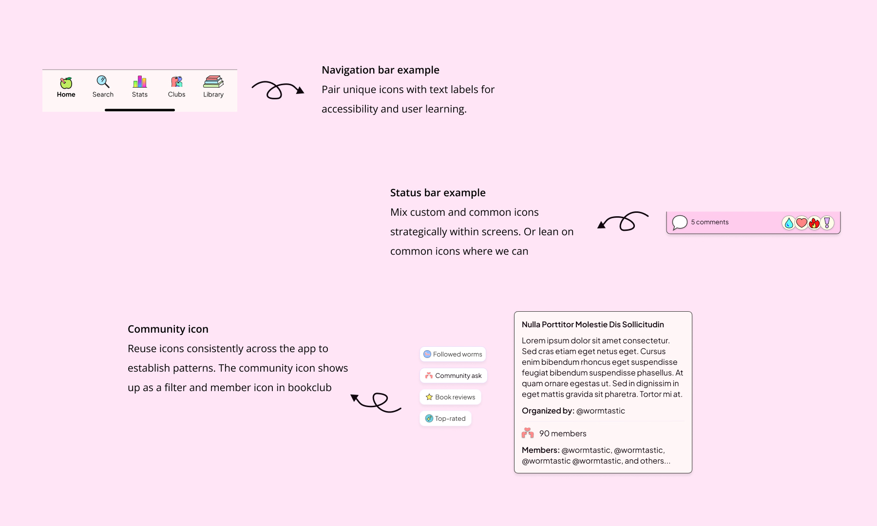
Status Messages
Impact & Results
- Reduced component variations by 40% while increasing functionality
- Reduced design-to-development handoff time by 60% through documented component library
- Improved design consistency across mobile platforms by 75% through systematic approach
- Achieved 90% WCAG AA compliance for color combinations
Learnings & Impact
The update is currently in development and I’m working closely with the founder and developer to ensure the relaunch is smooth. As we move through development, I've gathered some valuable insights:
- Stakeholder collaboration revealed crucial user behaviors - like how personally invested users are in their bookworm profile images as a form of self-expression. These insights helped keep user needs at the center of design decisions.
- I had to find a balance between the founder's desire for a colorful app and my responsibility to ensure the app is accessible to all users. This involved explaining my design choices and the user experience principles behind them in a clear and understandable way.
- Encourage your stakeholders to feel comfortable sharing their ideas. I recall a stakeholder saying, "I know this color choice is terrible, but I like it." I responded, "Absolutely not! Let's work on refining it." This approach fostered trust and helped me understand their perspective better.
- Creating clear systems and guidelines didn't just improve consistency—it enabled the team to move faster and make confident design decisions independently, reducing bottlenecks as we prepare for growth.


currently studying Industrial Design Engineering at TU Delft
Creating a design system for Bookworm
Summary
When I joined Bookworm, a vibrant reading app and social community, I saw an opportunity to elevate its visual design while preserving its welcoming, colorful spirit. The app helps users track their reading journey, connect with fellow book lovers, and join book clubs across iOS, Android, and web platforms.
Project type
UX/UI
Role
Designer
Year
2025

The Challenge
With 70% of our users on mobile, I started with a comprehensive mobile-first design audit. While the existing design was fun and experimental, it needed refinement to reach its full potential. The biggest challenge? The founder loves color (and so do I!), but I needed to approach color strategically while staying true to Bookworm's vibrant personality while ensuring usability and accessibility.
Key issues
- Inconsistent typography across platforms
- Irregular spacing and visual hierarchy
- Inconsistent gradient usage across pages
- Accessibility concerns with color combinations
Research & Strategy
I dove into competitive research, analyzing how other platforms handle similar challenges:
- Social Platforms: Reddit, LinkedIn, Twitter (for text-heavy feeds)
- Wellness Apps: Headspace, Tiimo (for approachable design)
- Direct Competitors: Fable, Storygraph, Goodreads
Building the Foundation
The existing app used multiple header styles and inconsistent font weights that weren't optimally scaled. After extensive testing, I established a clear typography hierarchy based on a 16px base font size for mobile, creating a more cohesive reading experience while maintaining the app's approachable personality.
Color Strategy
- Defined consistent app backgrounds for main pages
- Created softer color gradients that balance accessibility with vibrancy
- Built a comprehensive color system with defined tokens
- Established clear rules for primary, secondary, and tertiary colors
- Tested color combinations to ensure accessibility compliance
Status Messages
Impact & Results
- Reduced component variations by 40% while increasing functionality
- Reduced design-to-development handoff time by 60% through documented component library
- Improved design consistency across mobile platforms by 75% through systematic approach
- Achieved 90% WCAG AA compliance for color combinations
Learnings & Impact
The update is currently in development and I’m working closely with the founder and developer to ensure the relaunch is smooth. As we move through development, I've gathered some valuable insights:
- Stakeholder collaboration revealed crucial user behaviors - like how personally invested users are in their bookworm profile images as a form of self-expression. These insights helped keep user needs at the center of design decisions.
- I had to find a balance between the founder's desire for a colorful app and my responsibility to ensure the app is accessible to all users. This involved explaining my design choices and the user experience principles behind them in a clear and understandable way.
- Encourage your stakeholders to feel comfortable sharing their ideas. I recall a stakeholder saying, "I know this color choice is terrible, but I like it." I responded, "Absolutely not! Let's work on refining it." This approach fostered trust and helped me understand their perspective better.
- Creating clear systems and guidelines didn't just improve consistency—it enabled the team to move faster and make confident design decisions independently, reducing bottlenecks as we prepare for growth.
currently studying Industrial Design Engineering at TU Delft
Creating a design system for Bookworm
Summary
When I joined Bookworm, a vibrant reading app and social community, I saw an opportunity to elevate its visual design while preserving its welcoming, colorful spirit. The app helps users track their reading journey, connect with fellow book lovers, and join book clubs across iOS, Android, and web platforms.
Project type
UX/UI
Role
Designer
Year
2025

The Challenge
With 70% of our users on mobile, I started with a comprehensive mobile-first design audit. While the existing design was fun and experimental, it needed refinement to reach its full potential. The biggest challenge? The founder loves color (and so do I!), but I needed to approach color strategically while staying true to Bookworm's vibrant personality while ensuring usability and accessibility.
Key issues
- Inconsistent typography across platforms
- Irregular spacing and visual hierarchy
- Inconsistent gradient usage across pages
- Accessibility concerns with color combinations
Research & Strategy
I dove into competitive research, analyzing how other platforms handle similar challenges:
- Social Platforms: Reddit, LinkedIn, Twitter (for text-heavy feeds)
- Wellness Apps: Headspace, Tiimo (for approachable design)
- Direct Competitors: Fable, Storygraph, Goodreads
Building the Foundation
The existing app used multiple header styles and inconsistent font weights that weren't optimally scaled. After extensive testing, I established a clear typography hierarchy based on a 16px base font size for mobile, creating a more cohesive reading experience while maintaining the app's approachable personality.
Color Strategy
- Defined consistent app backgrounds for main pages
- Created softer color gradients that balance accessibility with vibrancy
- Built a comprehensive color system with defined tokens
- Established clear rules for primary, secondary, and tertiary colors
- Tested color combinations to ensure accessibility compliance
Status Messages
Impact & Results
- Reduced component variations by 40% while increasing functionality
- Reduced design-to-development handoff time by 60% through documented component library
- Improved design consistency across mobile platforms by 75% through systematic approach
- Achieved 90% WCAG AA compliance for color combinations
Learnings & Impact
The update is currently in development and I’m working closely with the founder and developer to ensure the relaunch is smooth. As we move through development, I've gathered some valuable insights:
- Stakeholder collaboration revealed crucial user behaviors - like how personally invested users are in their bookworm profile images as a form of self-expression. These insights helped keep user needs at the center of design decisions.
- I had to find a balance between the founder's desire for a colorful app and my responsibility to ensure the app is accessible to all users. This involved explaining my design choices and the user experience principles behind them in a clear and understandable way.
- Encourage your stakeholders to feel comfortable sharing their ideas. I recall a stakeholder saying, "I know this color choice is terrible, but I like it." I responded, "Absolutely not! Let's work on refining it." This approach fostered trust and helped me understand their perspective better.
- Creating clear systems and guidelines didn't just improve consistency—it enabled the team to move faster and make confident design decisions independently, reducing bottlenecks as we prepare for growth.
currently studying Industrial Design Engineering at TU Delft
Christina Campbell
Work
About
Contact
Creating a design system for Bookworm
Summary
When I joined Bookworm, a vibrant reading app and social community, I saw an opportunity to elevate its visual design while preserving its welcoming, colorful spirit. The app helps users track their reading journey, connect with fellow book lovers, and join book clubs across iOS, Android, and web platforms.
Project type
UX/UI
Role
Designer
Year
2025

The Challenge
With 70% of our users on mobile, I started with a comprehensive mobile-first design audit. While the existing design was fun and experimental, it needed refinement to reach its full potential. The biggest challenge? The founder loves color (and so do I!), but I needed to approach color strategically while staying true to Bookworm's vibrant personality while ensuring usability and accessibility.
Key issues
- Inconsistent typography across platforms
- Irregular spacing and visual hierarchy
- Inconsistent gradient usage across pages
- Accessibility concerns with color combinations
Research & Strategy
I dove into competitive research, analyzing how other platforms handle similar challenges:
- Social Platforms: Reddit, LinkedIn, Twitter (for text-heavy feeds)
- Wellness Apps: Headspace, Tiimo (for approachable design)
- Direct Competitors: Fable, Storygraph, Goodreads
Building the Foundation
The existing app used multiple header styles and inconsistent font weights that weren't optimally scaled. After extensive testing, I established a clear typography hierarchy based on a 16px base font size for mobile, creating a more cohesive reading experience while maintaining the app's approachable personality.
Color Strategy
- Defined consistent app backgrounds for main pages
- Created softer color gradients that balance accessibility with vibrancy
- Built a comprehensive color system with defined tokens
- Established clear rules for primary, secondary, and tertiary colors
- Tested color combinations to ensure accessibility compliance
Status Messages
Results
- Reduced component variations by 40% while increasing functionality
- Reduced design-to-development handoff time by 60% through documented component library
- Improved design consistency across mobile platforms by 75% through systematic approach
- Achieved 90% WCAG AA compliance for color combinations
Learnings
The update is currently in development and I’m working closely with the founder and developer to ensure the relaunch is smooth. As we move through development, I've gathered some valuable insights:
- Stakeholder collaboration revealed crucial user behaviors - like how personally invested users are in their bookworm profile images as a form of self-expression. These insights helped keep user needs at the center of design decisions.
- I had to find a balance between the founder's desire for a colorful app and my responsibility to ensure the app is accessible to all users. This involved explaining my design choices and the user experience principles behind them in a clear and understandable way.
- Encourage your stakeholders to feel comfortable sharing their ideas. I recall a stakeholder saying, "I know this color choice is terrible, but I like it." I responded, "Absolutely not! Let's work on refining it." This approach fostered trust and helped me understand their perspective better.
- Creating clear systems and guidelines didn't just improve consistency—it enabled the team to move faster and make confident design decisions independently, reducing bottlenecks as we prepare for growth.
currently studying Industrial Design Engineering at TU Delft
Christina Campbell
Work
About
Contact