

currently studying Industrial Design Engineering at TU Delft
Introducing a premium subscription
Project type
UX/UI
Role
Designer
Year
2024

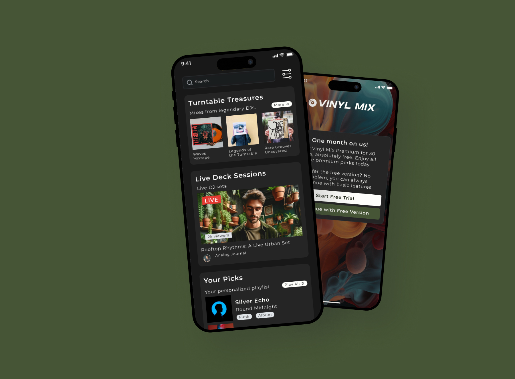
A preview of the Vinyl Mix premium subsciption
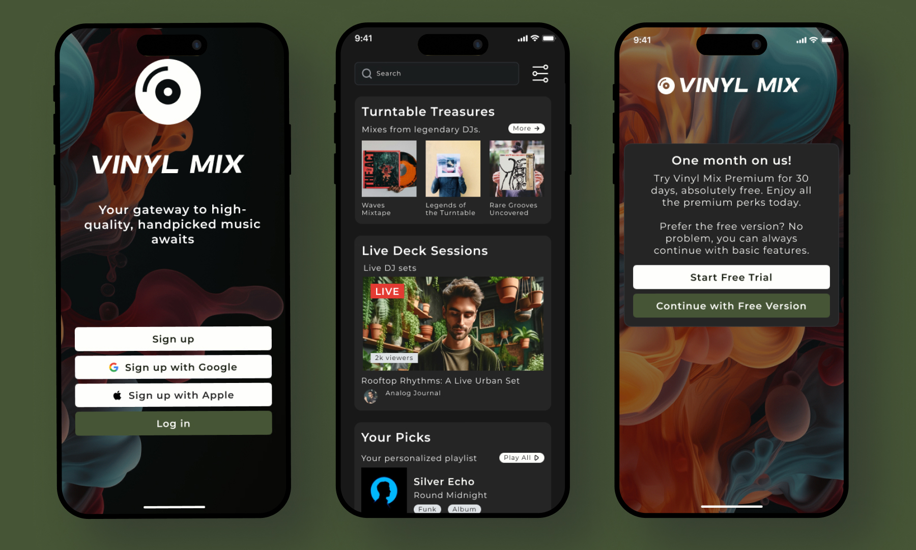
Vinyl mix persona
Secondary research
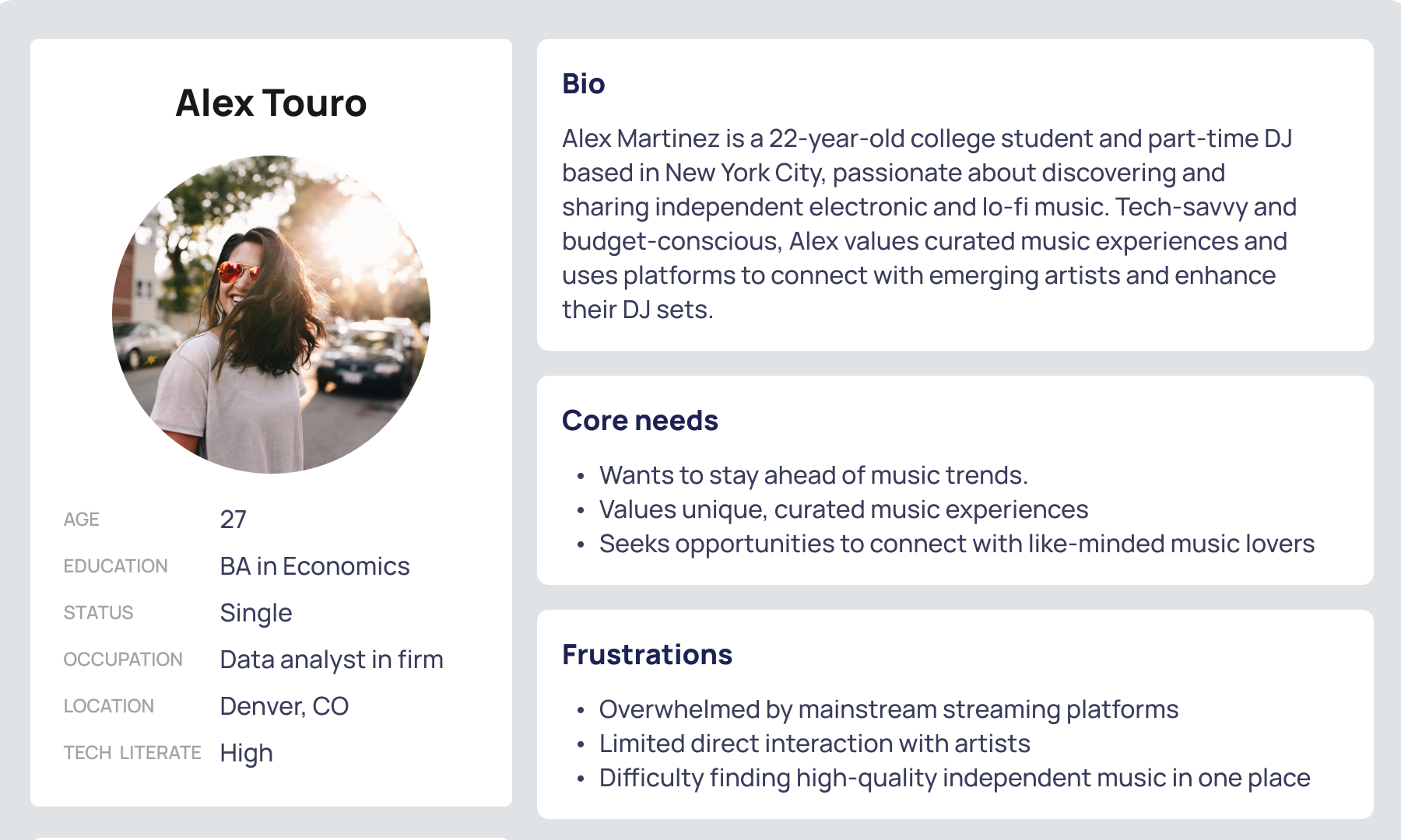
My discovery process was based on several factors. Since this is a fictional music app, I conducted secondary research to determine how other music apps introduced a premium subscription to new and existing users. Plus, look deeper into the IA.
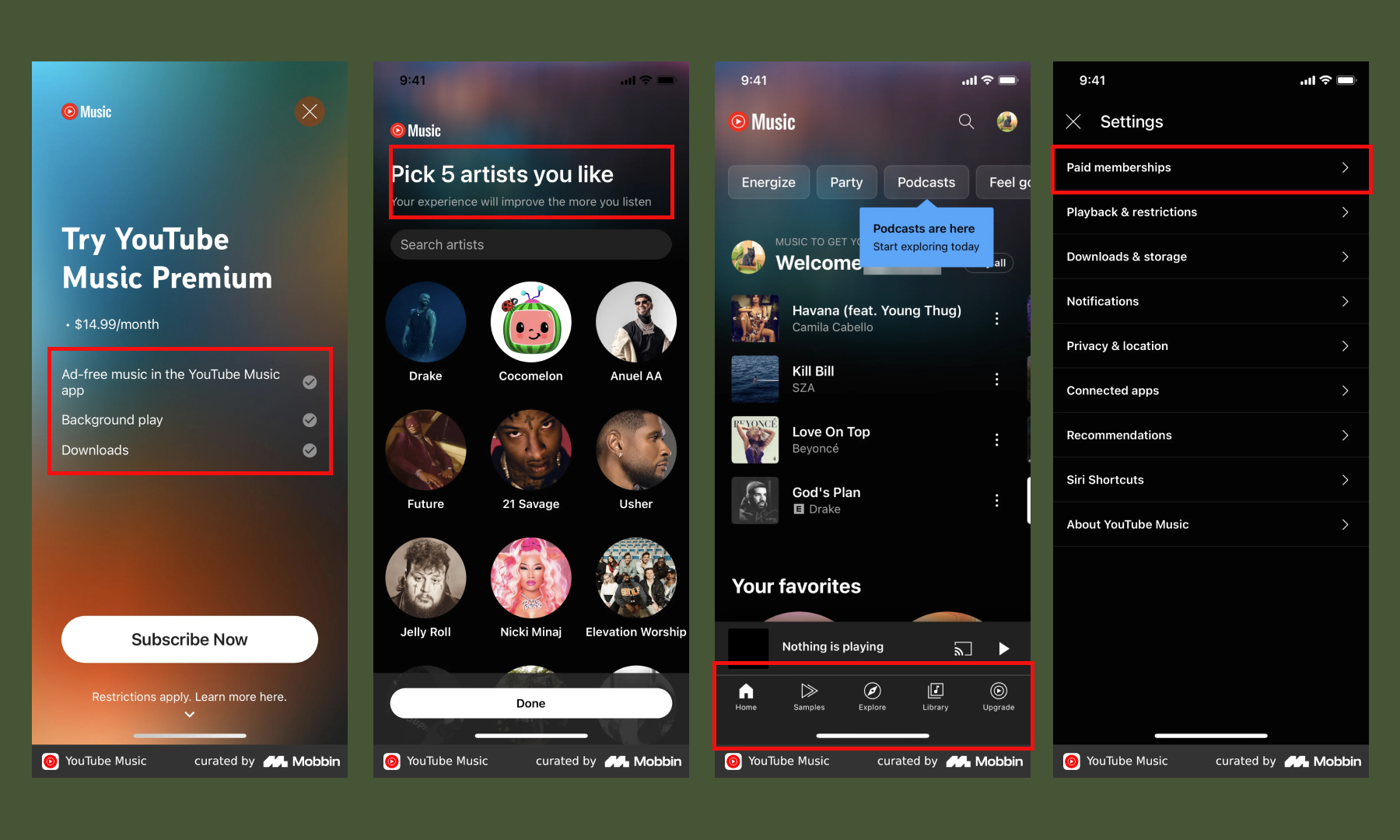
Another important element of the business goal is allowing existing users to sign up for a premium account, so I needed to understand the information architecture of other apps.
User flows
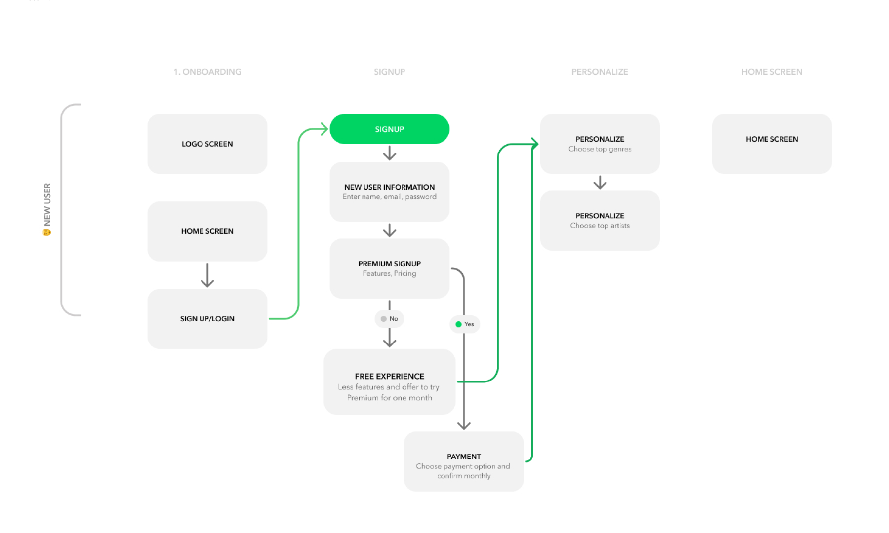
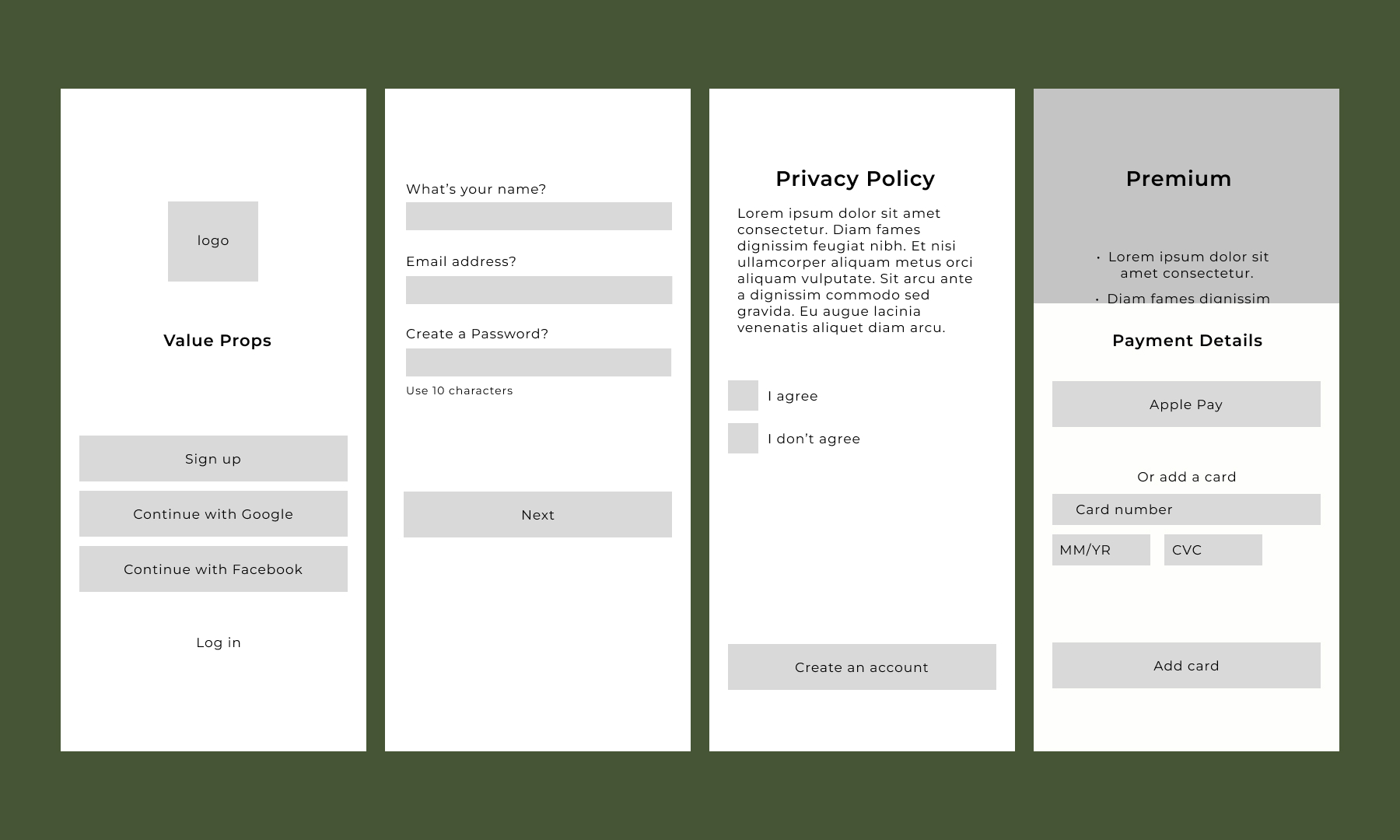
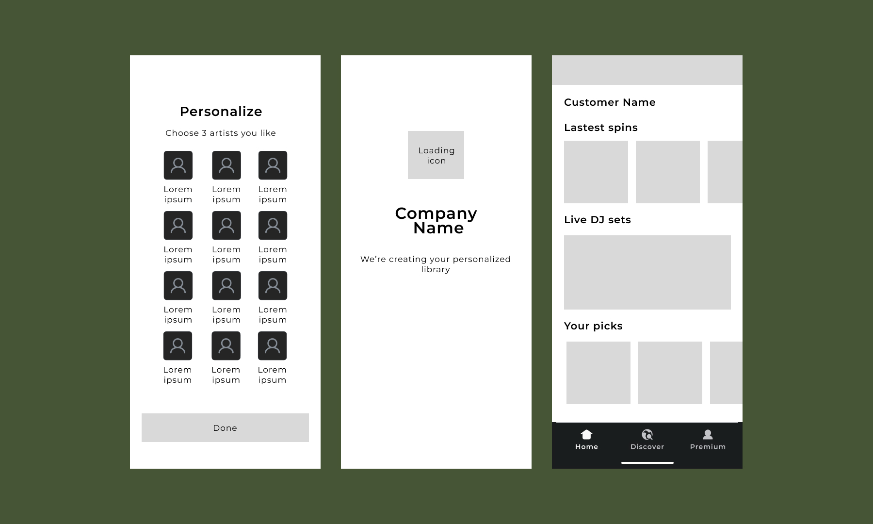
I sketched out the two main user journeys to test early ideas for solving the business problem before creating detailed designs. For new users signing up, my aim was to ensure easy navigation and clearly communicate the value of a premium subscription. In my research, I found that offering a free monthly trial is a valuable incentive, but it should only be presented after introducing the premium paid version. I also made sure to include the Apple Pay option for easy payment.
Wireframes
New user flow (1/2)
New user flow (2/2)
Returning users
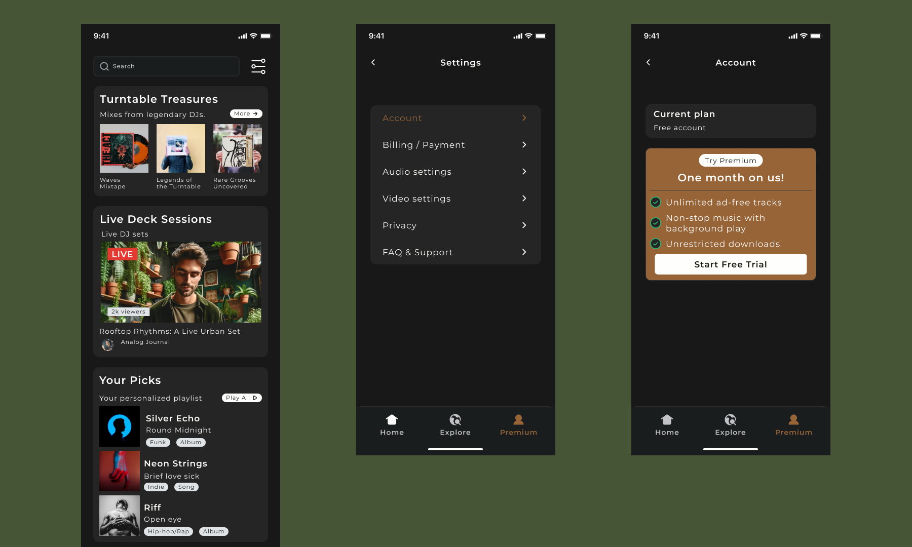
For returning users, I avoided using a pop-up to announce premium features. Instead, I changed the profile menu name to "premium" and used the profile image to pique interest in the change.
Usability test highlights
I conducted usability tests with five music-loving users, using two high-fidelity prototypes. Below are key highlights and my proposed solutions.
New Users:
- Issue 1: Users initially chose the non-premium option, then opted for the free trial.
- Solution 1: Updated the heading to "Use premium" for clarity and modified the premium copy to be more compelling.
Returning Users:
- Issue 1: The premium pop-up obstructed the home screen.
- Solution 1: Removed the pop-up after the initial test to avoid interruption.
- Issue 2: Returning users found the premium naming on the menu confusing.
- Solution 2: I changed the premium name to "Account" and introduced a banner for the premium offer with the option to close it.
Final updates and prototypes
Following the usability test, I made updates to my solution and addressed a few technical issues.
New user flow:
- I revamped the premium screen copy to showcase the perks of subscribing, aiming to prompt more immediate sign-ups without offering a free monthly trial.
- I updated the header to read, "Unlock the complete experience with premium" instead of "try premium."
Returning user flow:
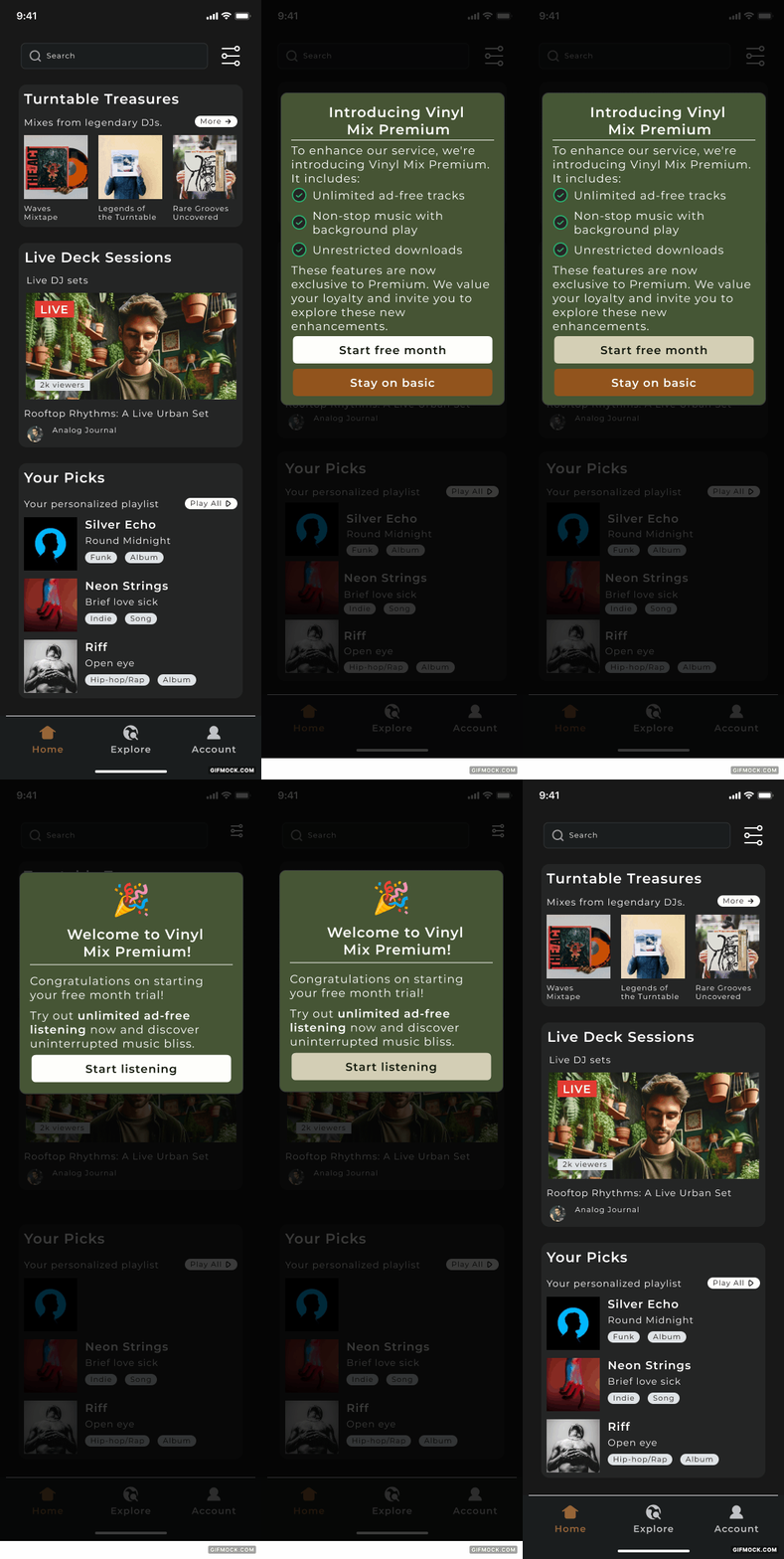
- Instead of expecting users to discover the premium account, I reintroduced the concept of a pop-up on the home screen but reframed it as a way to inform returning users about the new subscription model.
- Additionally, I included an immediate offer for a free month of premium. This offers a sense of goodwill with existing users.
currently studying Industrial Design Engineering at TU Delft
Introducing a premium subscription
Project type
UX/UI
Role
Designer
Year
2024

A preview of the Vinyl Mix premium subsciption
Vinyl mix persona
Secondary research
My discovery process was based on several factors. Since this is a fictional music app, I conducted secondary research to determine how other music apps introduced a premium subscription to new and existing users. Plus, look deeper into the IA.
Another important element of the business goal is allowing existing users to sign up for a premium account, so I needed to understand the information architecture of other apps.
User flows
I sketched out the two main user journeys to test early ideas for solving the business problem before creating detailed designs. For new users signing up, my aim was to ensure easy navigation and clearly communicate the value of a premium subscription. In my research, I found that offering a free monthly trial is a valuable incentive, but it should only be presented after introducing the premium paid version. I also made sure to include the Apple Pay option for easy payment.
Wireframes
New user flow (1/2)
New user flow (2/2)
Returning users
For returning users, I avoided using a pop-up to announce premium features. Instead, I changed the profile menu name to "premium" and used the profile image to pique interest in the change.
Usability test highlights
I conducted usability tests with five music-loving users, using two high-fidelity prototypes. Below are key highlights and my proposed solutions.
New Users:
- Issue 1: Users initially chose the non-premium option, then opted for the free trial.
- Solution 1: Updated the heading to "Use premium" for clarity and modified the premium copy to be more compelling.
Returning Users:
- Issue 1: The premium pop-up obstructed the home screen.
- Solution 1: Removed the pop-up after the initial test to avoid interruption.
- Issue 2: Returning users found the premium naming on the menu confusing.
- Solution 2: I changed the premium name to "Account" and introduced a banner for the premium offer with the option to close it.
Returning user flow:
- Instead of expecting users to discover the premium account, I reintroduced the concept of a pop-up on the home screen but reframed it as a way to inform returning users about the new subscription model.
- Additionally, I included an immediate offer for a free month of premium. This offers a sense of goodwill with existing users.
New user flow:
- I revamped the premium screen copy to showcase the perks of subscribing, aiming to prompt more immediate sign-ups without offering a free monthly trial.
- I updated the header to read, "Unlock the complete experience with premium" instead of "try premium."
currently studying Industrial Design Engineering at TU Delft
Christina Campbell
Work
About
Contact
Introducing a premium subscription
Project type
UX/UI
Role
Designer
Year
2024

A preview of the Vinyl Mix premium subscription
Vinyl mix persona
Secondary research
My discovery process was based on several factors. Since this is a fictional music app, I conducted secondary research to determine how other music apps introduced a premium subscription to new and existing users. Plus, look deeper into the IA.
Another important element of the business goal is allowing existing users to sign up for a premium account, so I needed to understand the information architecture of other apps.
User flows
I sketched out the two main user journeys to test early ideas for solving the business problem before creating detailed designs. For new users signing up, my aim was to ensure easy navigation and clearly communicate the value of a premium subscription. In my research, I found that offering a free monthly trial is a valuable incentive, but it should only be presented after introducing the premium paid version. I also made sure to include the Apple Pay option for easy payment.
Wireframes
New user flow (1/2)
New user flow (2/2)
Returning users
For returning users, I avoided using a pop-up to announce premium features. Instead, I changed the profile menu name to "premium" and used the profile image to pique interest in the change.
Usability test highlights
I conducted usability tests with five music-loving users, using two high-fidelity prototypes. Below are key highlights and my proposed solutions.
New Users:
- Issue 1: Users initially chose the non-premium option, then opted for the free trial.
- Solution 1: Updated the heading to "Use premium" for clarity and modified the premium copy to be more compelling.
Returning Users:
- Issue 1: The premium pop-up obstructed the home screen.
- Solution 1: Removed the pop-up after the initial test to avoid interruption.
- Issue 2: Returning users found the premium naming on the menu confusing.
- Solution 2: I changed the premium name to "Account" and introduced a banner for the premium offer with the option to close it.
Final updates and prototypes
Following the usability test, I made updates to my solution and addressed a few technical issues.
New user flow:
- I revamped the premium screen copy to showcase the perks of subscribing, aiming to prompt more immediate sign-ups without offering a free monthly trial.
- I updated the header to read, "Unlock the complete experience with premium" instead of "try premium."
Returning user flow:
- Instead of expecting users to discover the premium account, I reintroduced the concept of a pop-up on the home screen but reframed it as a way to inform returning users about the new subscription model.
- Additionally, I included an immediate offer for a free month of premium. This offers a sense of goodwill with existing users.
Christina Campbell
Work
About
Contact
Introducing a premium subscription
Project type
UX/UI
Role
Designer
Year
2024

A preview of the Vinyl Mix premium subscription
Vinyl mix persona
Secondary research
My discovery process was based on several factors. Since this is a fictional music app, I conducted secondary research to determine how other music apps introduced a premium subscription to new and existing users. Plus, look deeper into the IA.
Another important element of the business goal is allowing existing users to sign up for a premium account, so I needed to understand the information architecture of other apps.
User flows
I sketched out the two main user journeys to test early ideas for solving the business problem before creating detailed designs. For new users signing up, my aim was to ensure easy navigation and clearly communicate the value of a premium subscription. In my research, I found that offering a free monthly trial is a valuable incentive, but it should only be presented after introducing the premium paid version. I also made sure to include the Apple Pay option for easy payment.
Wireframes
New user flow (1/2)
New user flow (2/2)
Final updates and prototypes
Following the usability test, I made updates to my solution and addressed a few technical issues.
New user flow:
- I revamped the premium screen copy to showcase the perks of subscribing, aiming to prompt more immediate sign-ups without offering a free monthly trial.
- I updated the header to read, "Unlock the complete experience with premium" instead of "try premium."
Returning user flow:
- Instead of expecting users to discover the premium account, I reintroduced the concept of a pop-up on the home screen but reframed it as a way to inform returning users about the new subscription model.
- Additionally, I included an immediate offer for a free month of premium. This offers a sense of goodwill with existing users.
currently studying Industrial Design Engineering at TU Delft